Chase Home Lending Website
TL;DR
For this project I had the opportunity to work with Huge as part of a stellar team, operating closely with the Experience Lead and Visual Designer. Our client, Chase, sought to enhance the usability and functionality of their Home Lending website. Our scope involved redesigning key screens of the experience to effectively showcase the content and information within.
To accomplish this, we conducted a thorough audit, identifying opportunities to optimize navigational pathways and content structure, and heavily relied on user testing to implement usability improvements.
PROBLEM
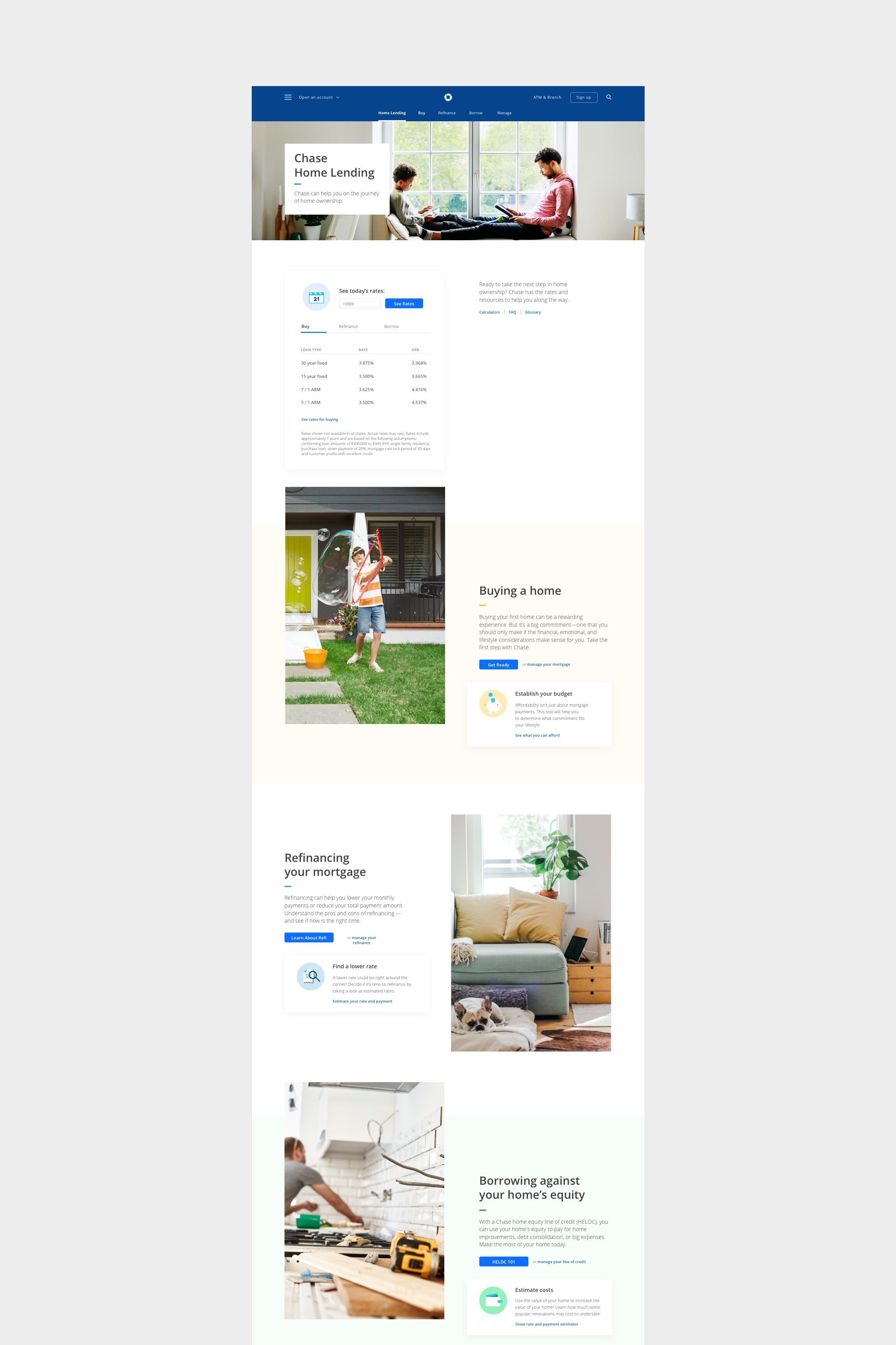
The Chase product ecosystem had adopted a microsite approach to manage product expansion, as seen with Home Lending, resulting in a disconnect from the overarching Chase brand ethos and global navigation framework.
GOALS
Better educate customers to Chase Home Lending’s (CHL) product offering by rethinking content and design.
Achieve balance for CHL by preserving its unique identity while seamlessly aligning with the global Chase brand.
MY ROLE
Information Architecture
User Flows
Wireframes
Interaction Design
User Testing
Documentation
PLATFORM/S
Web

Early wires explored primary nav options for the three categories within home lending (options without a persistent nav would utilize breadcrumbs) and hero treatments.
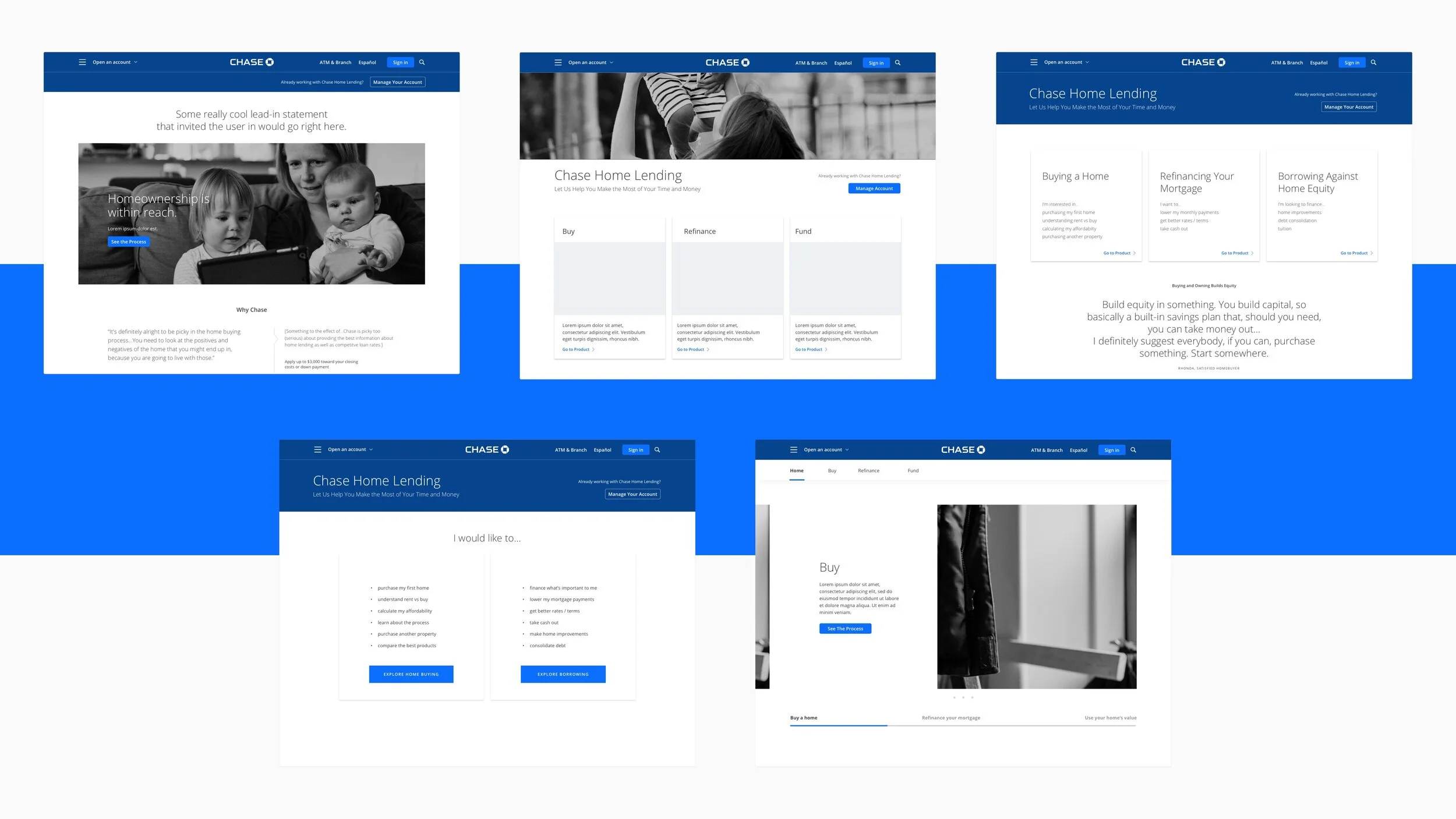
The current site had 3 levels of navigation whose functionality changed depending on the page. Early iterations explored options to clarify and consolidate the nav on interior pages.


We created a comprehensive sitemap of their current site, identifying important content buried 4 levels deep as well as other inefficiencies that didn’t lead users to the information they wanted.

User testing screens & findings
Homepage
- wouldn’t bother looking at video
- wants to get to the nuts-and-bolts of it
- interested in rates table
- most interested in seeing: rate, picking financial vehicle (loan type, term)
- too much info on page
- fund in nav doesn’t make sense (thinks it means how to raise money to afford a home)
- blue button: seeing the process is interesting
- would like to see info about process
- clicked on Show Rate and Payment Estimate
- would like to see: you could afford house of this much
- would like to see: here’s what your payment would be if you chose this rate
- today's rates is most beneficial
Estimating Your Budget page
- a lot to digest, expected
- content makes sense, its nice
- visualization of calculator is nice, inputs make sense
- well within expectation
- seeing the costs as a reminder is helpful, smart
- appreciates nav—can see where they are in the process
- the info they were expecting is further down the page
- seems wordy at first glance
- most valuable: understanding your costs section
- little things like explaining fees is really helpful
- likes the colors, layout, amount of info in affordability calculator
- calculator results should be first, rest of info below

Final desktop & mobile templates