Coinbase App Visual Design North Star
TL;DR
This was my first project as a product designer at Free Association working alongside two principal designers, a senior product director and our client’s senior product designer to define and help implement a major North Star initiative for their web app and native mobile experience.
PROBLEM
Coinbase had a confusing array of products bundled into different mobile and web app experiences across use cases and user types (e.g., individual user versus business) without clear principles.
Due to Coinbase’s exponential growth, their diversified product offerings were developing at a faster rate than their design system could handle.
GOALS
Define a visual design North Star that informs Coinbase’s Unified App vision to bring both individual and business users together into a shared web and mobile experience.
Inform the continued development of Coinbase's design system (CDS).
Deliver a prototype mapping to the core user segments of individuals, businesses, and institutions.
MY ROLE
UXR & Discovery
Content Architecture
UI / Visual Design
User Testing
Design System Management
Prototyping
PLATFORM/S
Web App
iOS
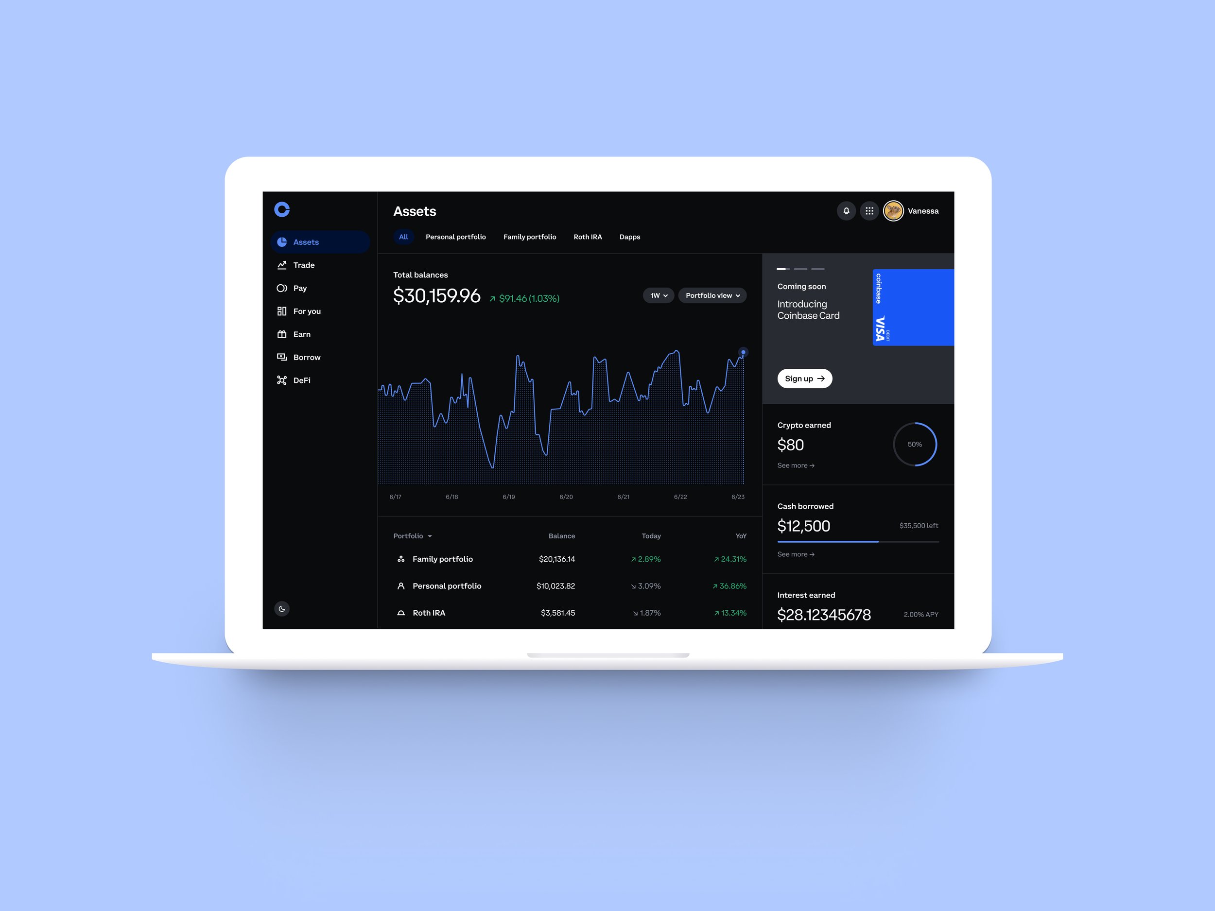
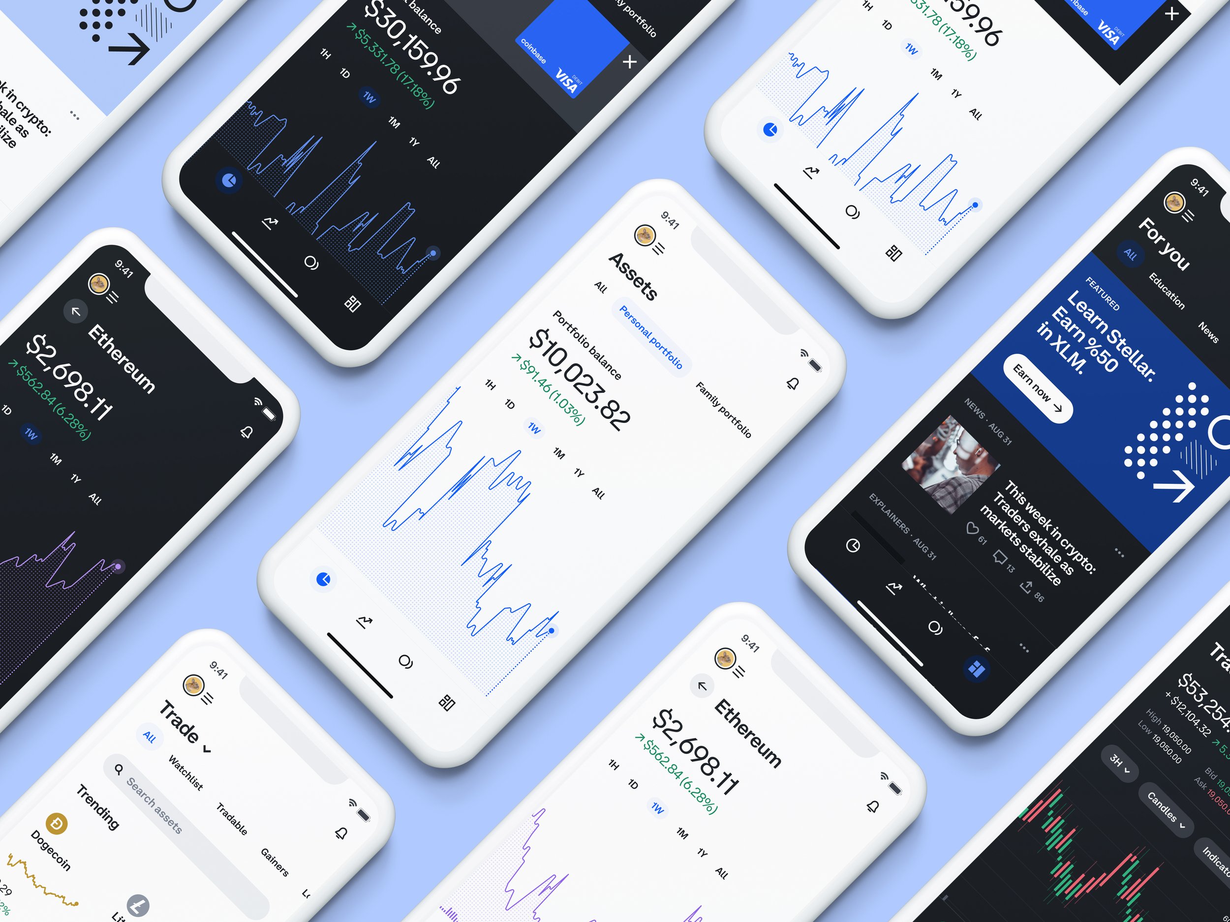
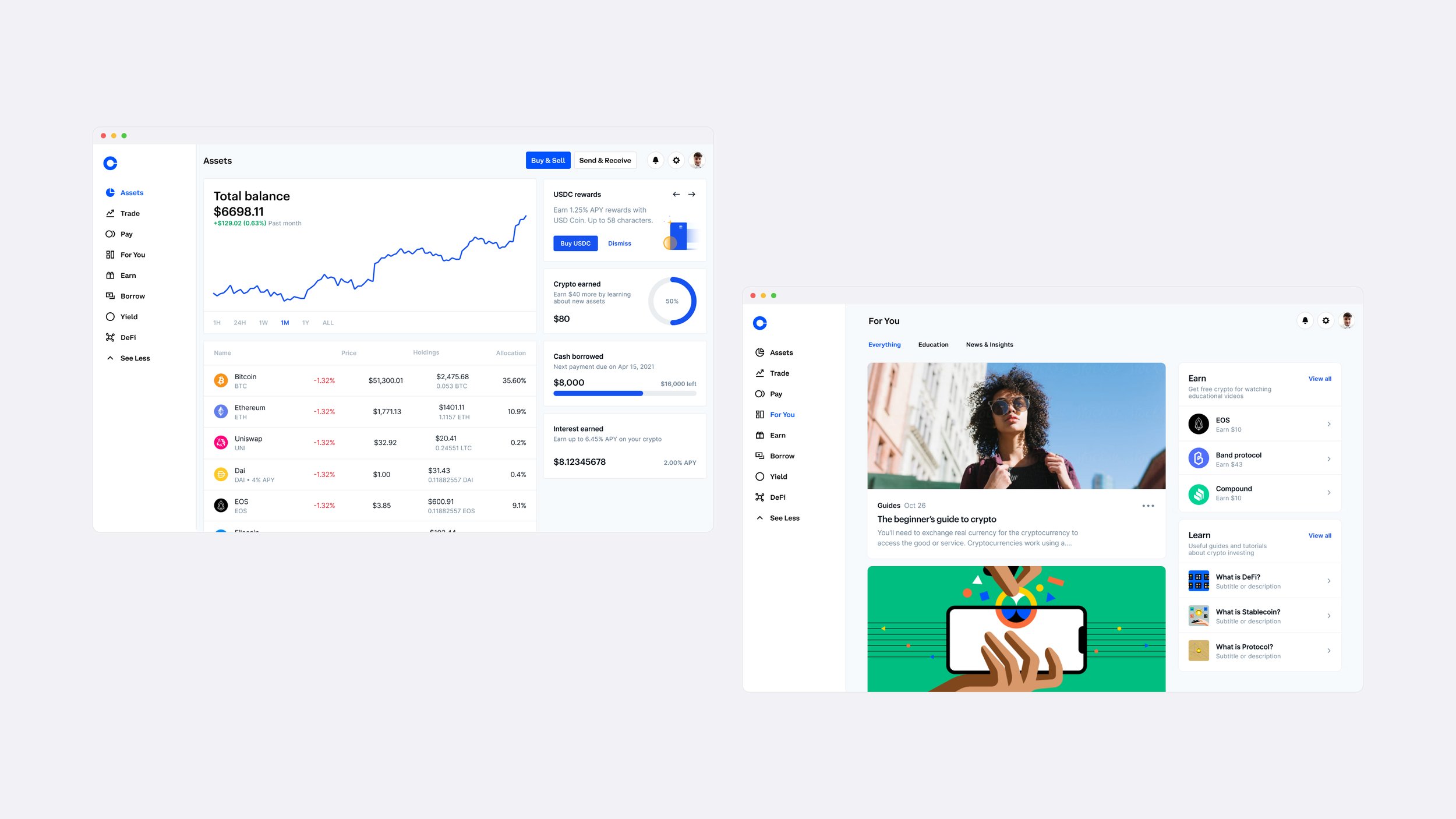
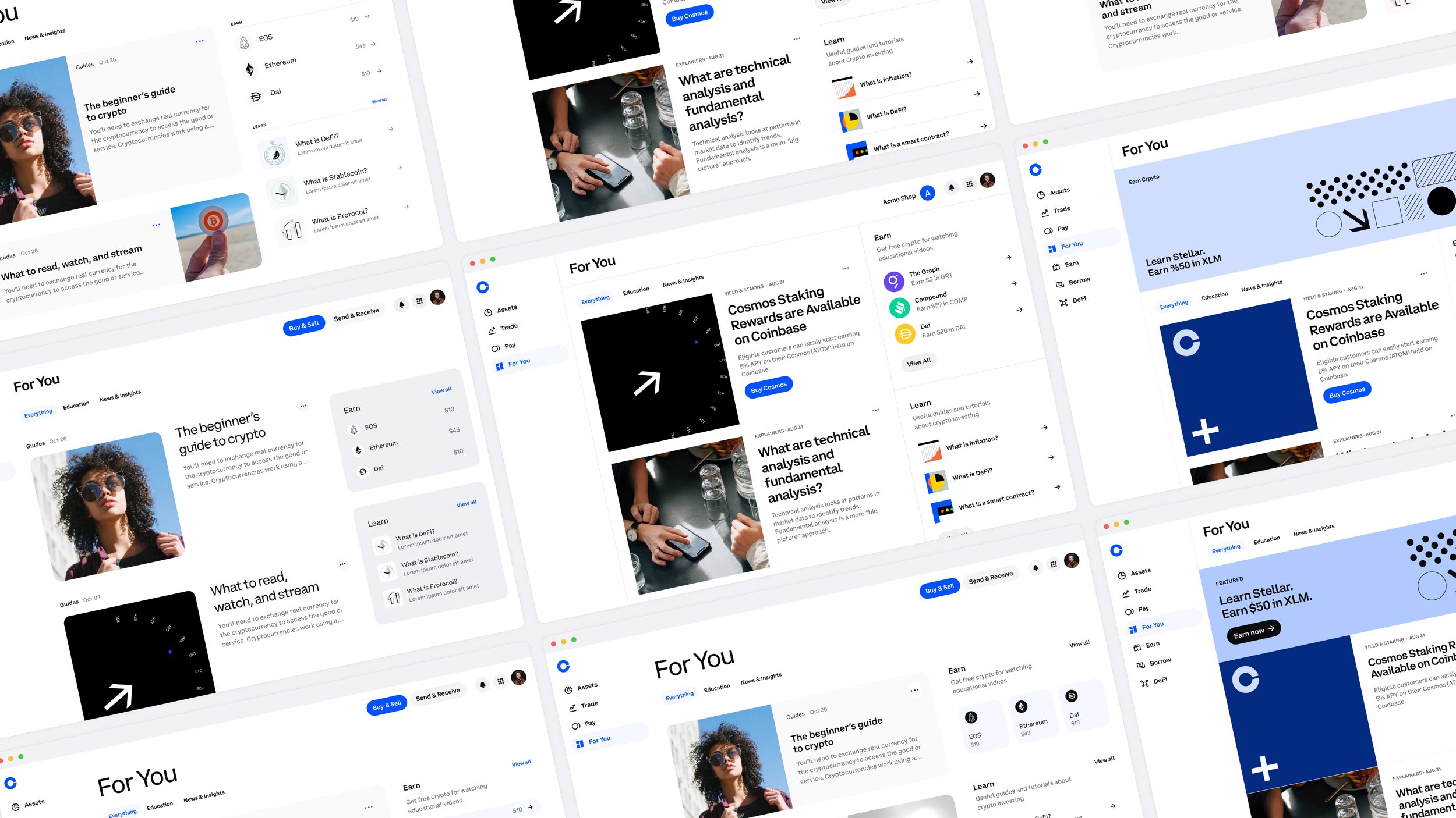
Reference Screens
Our team examined how the brand character showed up in the UI and the signal Coinbase conveyed globally. Our objective was to identify the narrative Coinbase intended to communicate and then determine the most effective content architecture to support that goal.
Essential, Savvy, & Creator Community
We explored 3 territories distilled from our landscape audit and affinity map. My focus was Creator Community, demonstrating how it could show up in product.


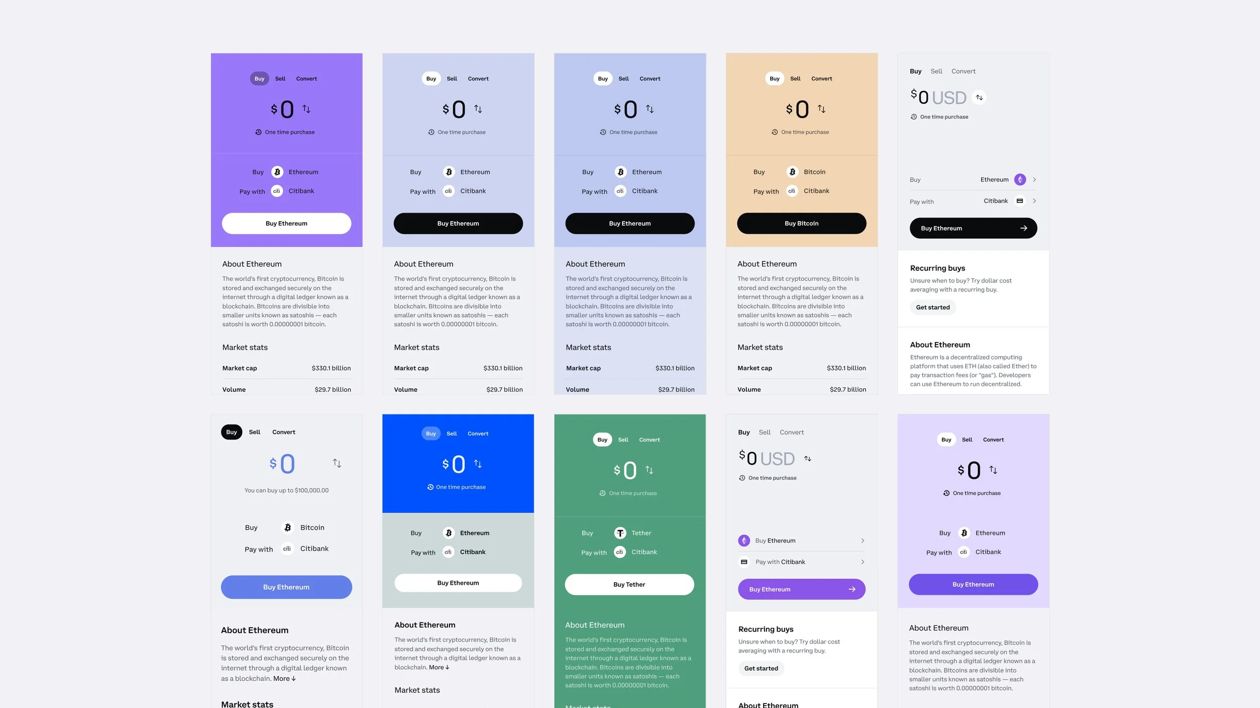
Design Explorations
We iterated on information hierarchy and taxonomy, as well as the voice of type and color within specific components using the ‘creator community’ lens. After many rounds of feedback, we deduced our visual territory for product to ‘essential’ with borrowed elements of ‘savvy’, honing in on key areas like charting and crypto asset depiction.
Essential is about making things concise, easy to understand, direct, and clear. This is where Coinbase’s retail product and most of its competitive landscape currently lives. It is designed to invite and drive engagement for every user segment.


Bitcoin
•
Dogecoin
•
Ethereum
•
Bitcoin • Dogecoin • Ethereum •
User Testing Takeaways
Pros
Overall positive reaction regarding the visual updates to the look and feel of the product.
Users cited attributes such as "simple, colorful, personal, futuristic, innovative”.
Treatments were on-brand with users’ perceptions of the Coinbase brand.
Color theming avatars and labels (for multi-user accounts) as well as key asset content served as effective visual cues.
Cons
Apply color in a systematic way that’s consistent across product.
Issues differentiating some colors due to color-blindness and neurodivergence with heavy color use.

Final Designs
Coinbase Design System Checklist
Met WCAG 2.1 guidelines
Worked on all devices
Complied with Apple's HIG and Google's Material guidelines
Interactions did not compete with OS interactions
Worked in light and dark mode
Worked across dense and normal component scales
Internationalization-ready