
THINX Cycle Set Builder UI
TL;DR
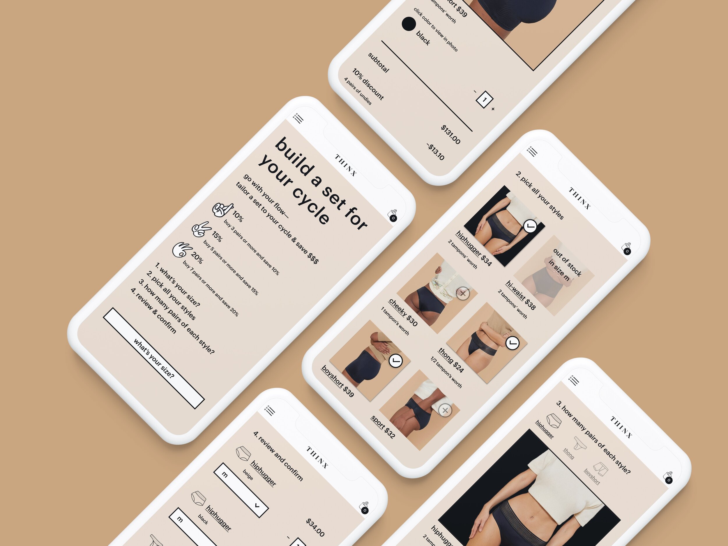
This was a fun project to work on for an awesome brand. I was called upon to help clarify the user experience and improve the Cycle Set Builder UI. This tool provides customers with an easy way to buy underwear in sets according to one's menstrual cycle and discover new styles. Most customers browse on mobile, but make their purchases on desktop. It was crucial that both experiences function seamlessly.
PROBLEM
Customers’ comprehension of the tool was impaired due to inconsistent visual hierarchy and lack of progressive disclosure creating information overload.
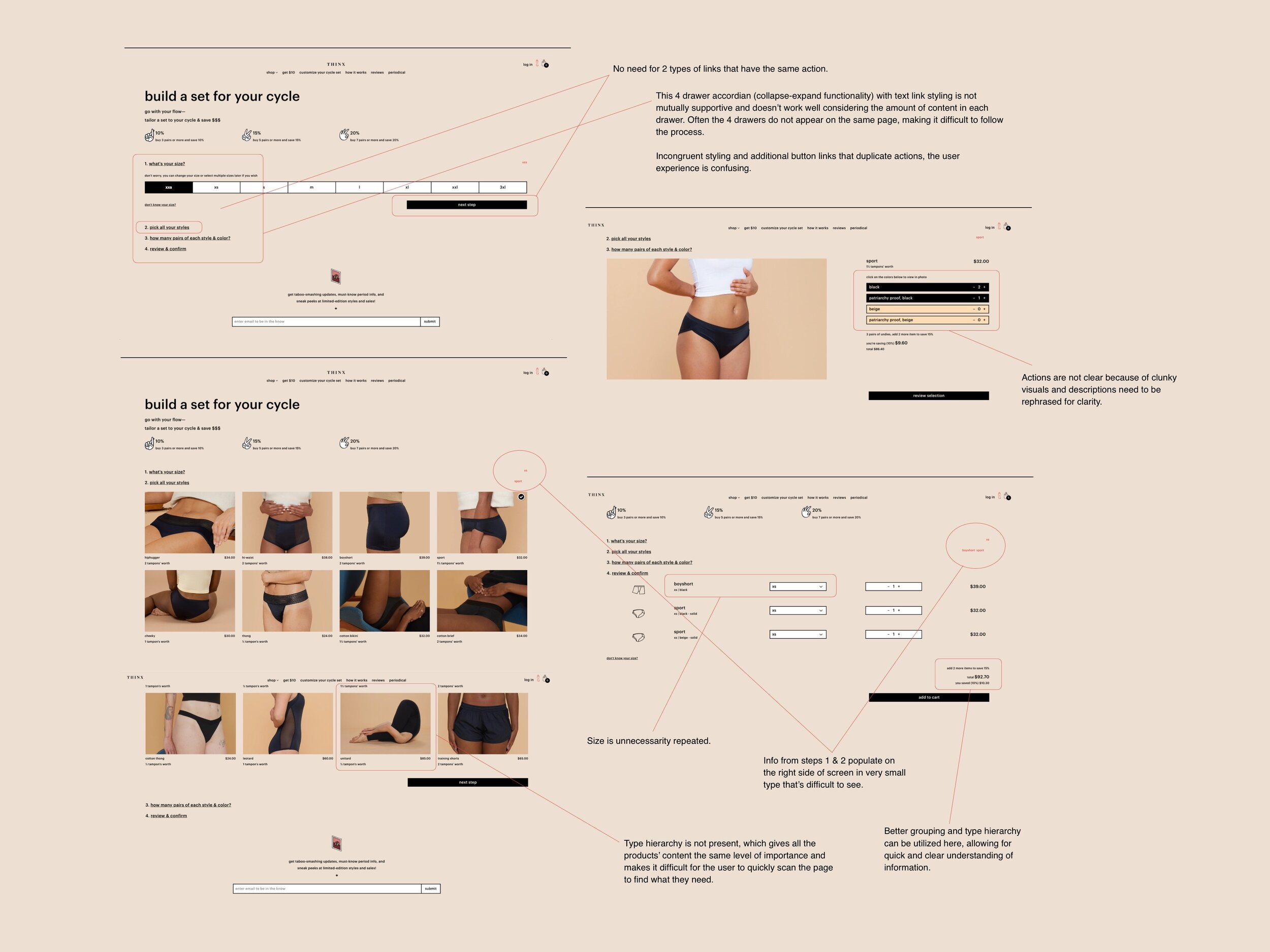
Some of the UI patterns selected for desktop were causing inefficiencies and friction on mobile devices, such as the step accordion utilized to display the customer’s progress.
Most participants from the usability testing felt the tool would be too prescriptive or restrictive for them to use.
GOAL
Address the research findings to optimize the Cycle Set Builder to be clear, intuitive and provide a seamless experience for both desktop and mobile customers.
MY ROLE
UXR
User Flows
UI / Visual Design
Documentation
PLATFORM/S
Web
UX key takeaways
Initial findings aligned with feedback provided by the team researcher’s report.
User feedback implemented
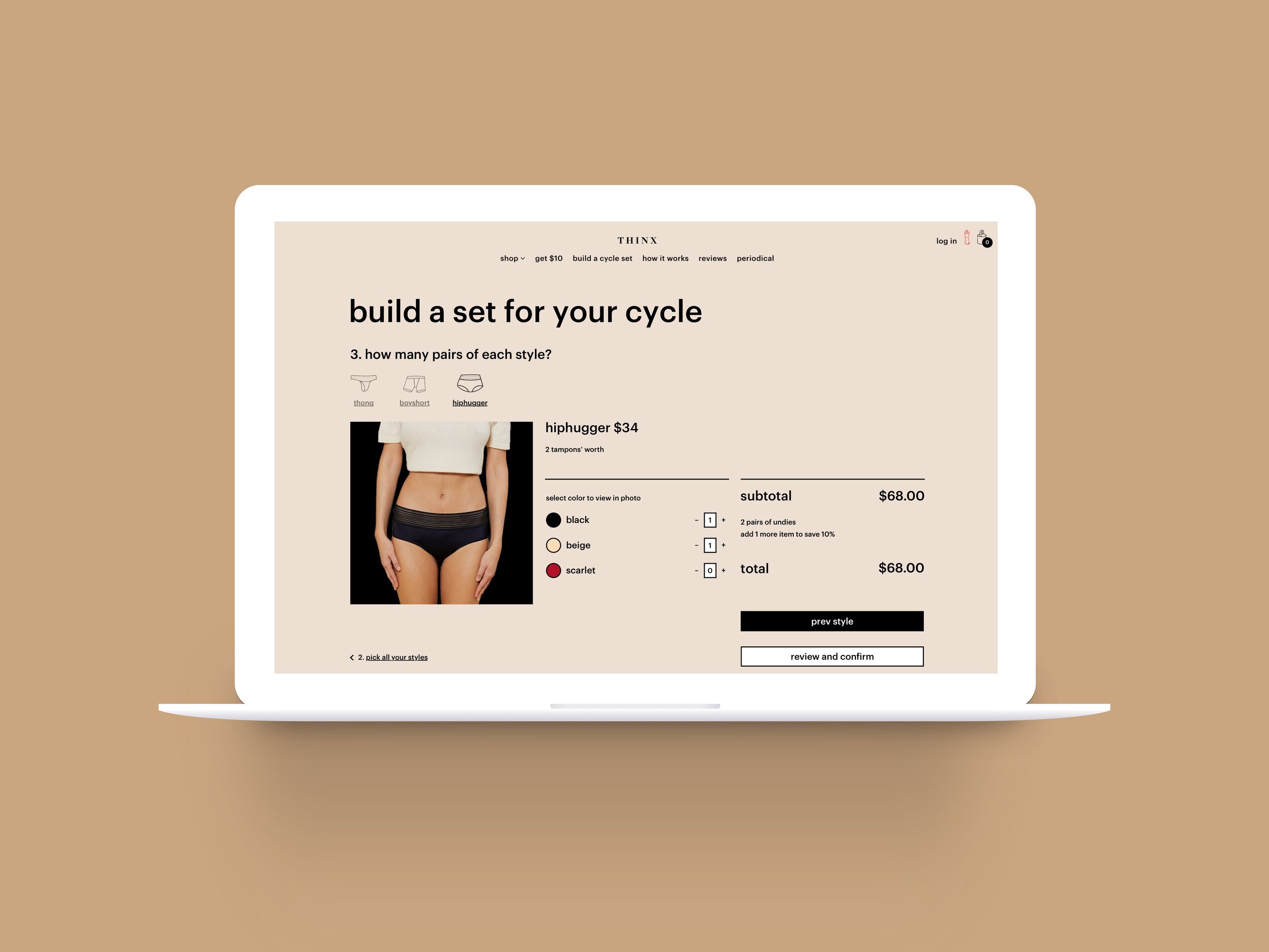
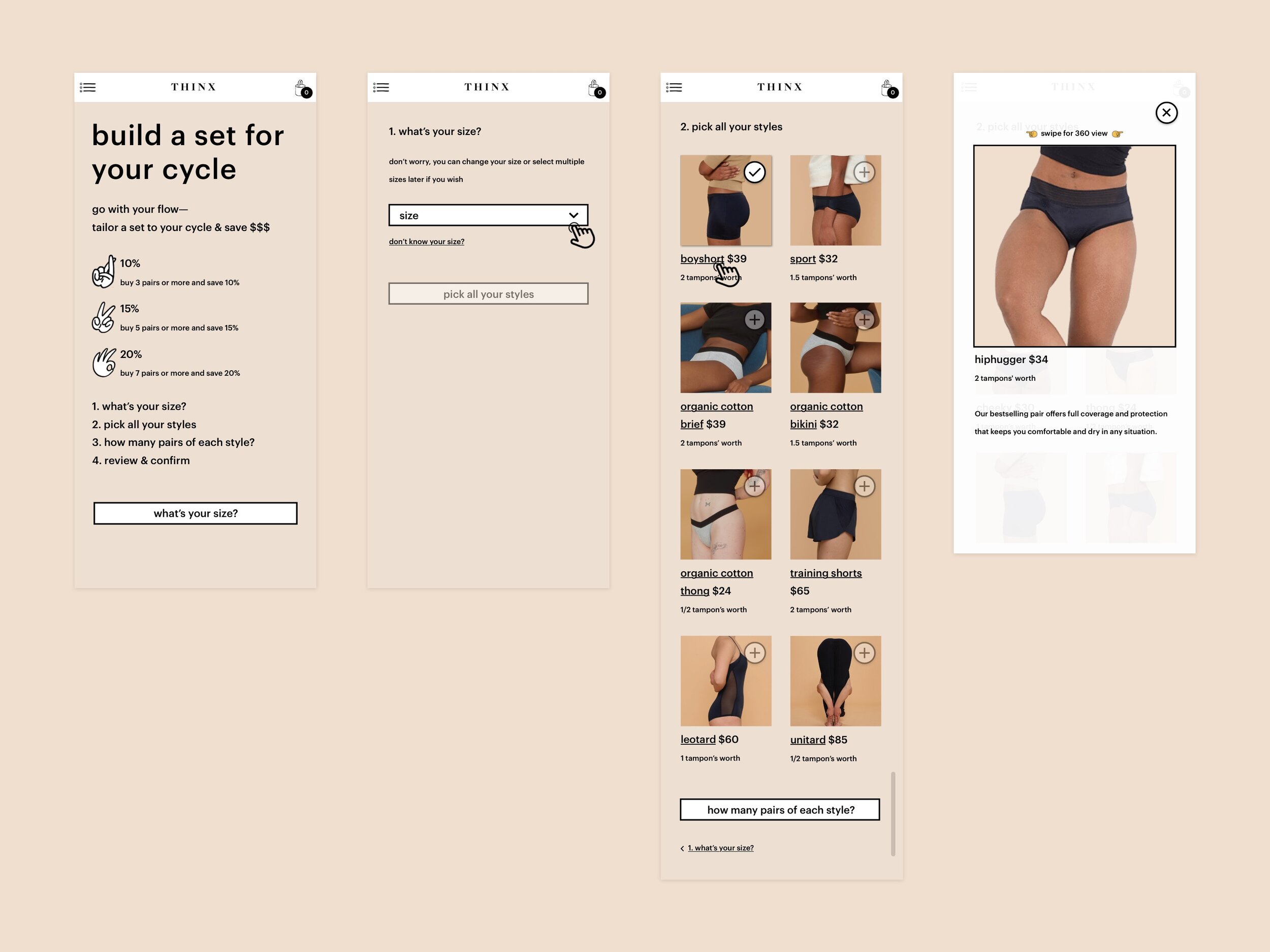
Use visual design to help users track the options they have already chosen and their progress as they go through the style section.
Allow users to see more information about each style.
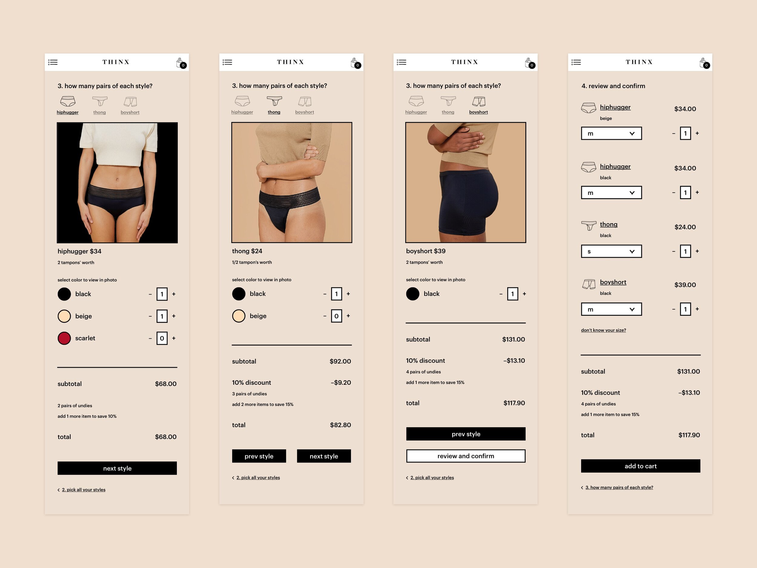
Consider showing participants the total cost throughout the process.


User feedback implemented
Use visual design elements to create a less overwhelming ‘review and confirm’ experience on mobile.
visit the site